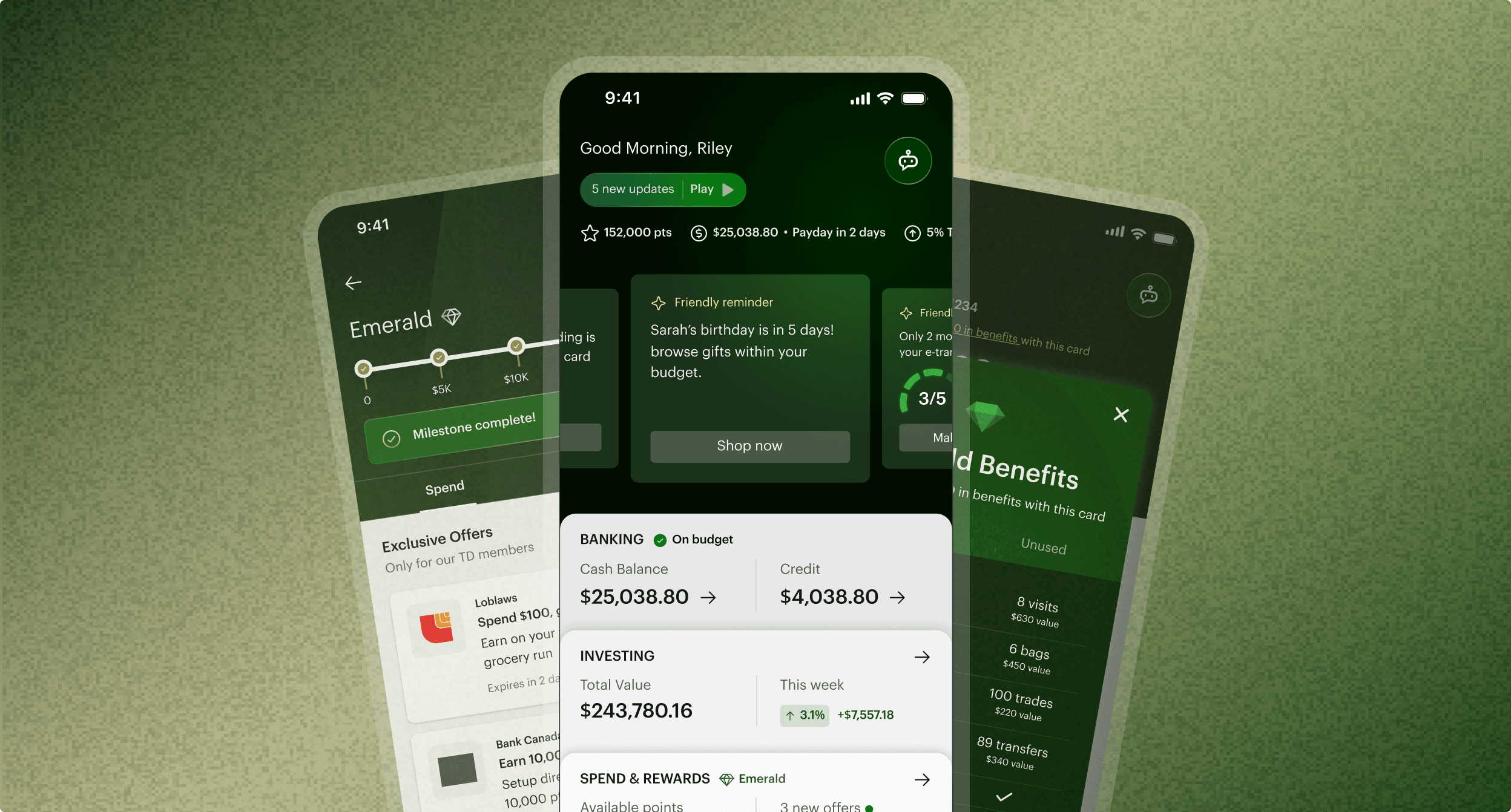
Designing the Next Generation of Mobile Banking
My Role
Responsible for end-to-end design of the product experience (concept, branding, prototype)
Team
Designers: 3
Consultants: 1
Timeline
3 weeks
Type
Mobile and other future states
OVERVIEW
Exploring future-facing banking experiences
We developed future-facing mobile banking concepts aimed at improving engagement, streamlining core experiences, and evolving the platform’s visual direction within enterprise constraints.
COMPETITIVE PRESSURE
Digital-first banks generate 2x the daily engagement of traditional banks
While competing banks grew by making finance feel rewarding and personal, traditional institutions struggled to move users beyond balance-checking creating a measurable gap in daily engagement.
42%
of Gen Z customers opt for online banks to handle their financial activities
$20 billion
in Canadian deposits moved to companies like Wealthsimple in a year
21%
of all Canadians now use digital-only banks which is up 11% since 2022
Canadians are slowing moving away from in-person banking.
THE OPPORTUNITY
How might we make everyday banking worth coming back to?
Crafting design principles
We created design principles that this project should embody. Visually, we also wanted to present the client with a sleek, modern reimagining of their brand.
Feel the Value
Through personalized rewards that reflect their loyalty and usage
Motivate Users
By turning spending and saving behaviours into progress milestones
Drive Engagement
By engaging users with their finances through quick, glanceable insights
I owned several key touchpoints and flows:
Mobile Widgets
Chatbot Flow
Spending+Rewards
WIDGET FEATURE
A widget that overwhelms is just as useless as no widget at all.
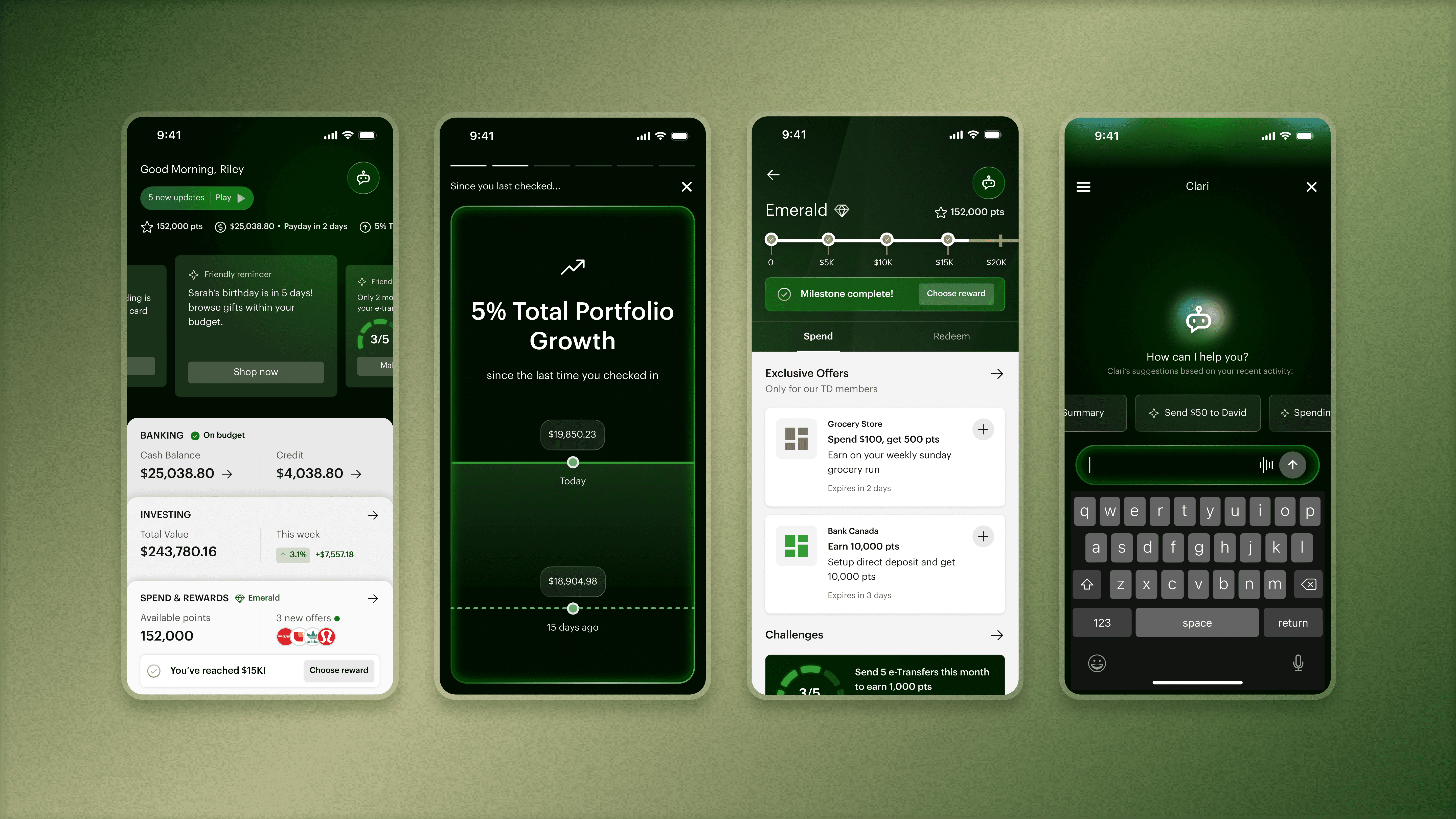
With engagement as the goal, I explored different ways to surface rewards, progress, and actions within a single home screen widget.

A modular widget that leads with actionables
Early directions struggled to balance information density with usability so through iteration I landed on prioritizing the most relevant information helps users focus and take action.

FINAL WIDGET DESIGN
Modular widgets to adapt to user's financial profile
The widget adapts based on what's most relevant to the user at that moment, whether that's a challenge deadline, an exclusive offer, or a quick way to connect with their AI tool.

FINAL PROTOTYPE
Relevance beats information density.
User needs were better served when the dashboard prioritized timely insights and next actions.
Rewards that feel personal.
Surface relevant rewards, perks, and offers based on the card you already use.
Handle payments with a simple conversation.
Skip the navigation and tell the assistant what needs to be done.
However…
The real future is where digital and human guidance works in tangent.
THE FUTURE OF IN-PERSON BANKING
So what happens to in-person banking?
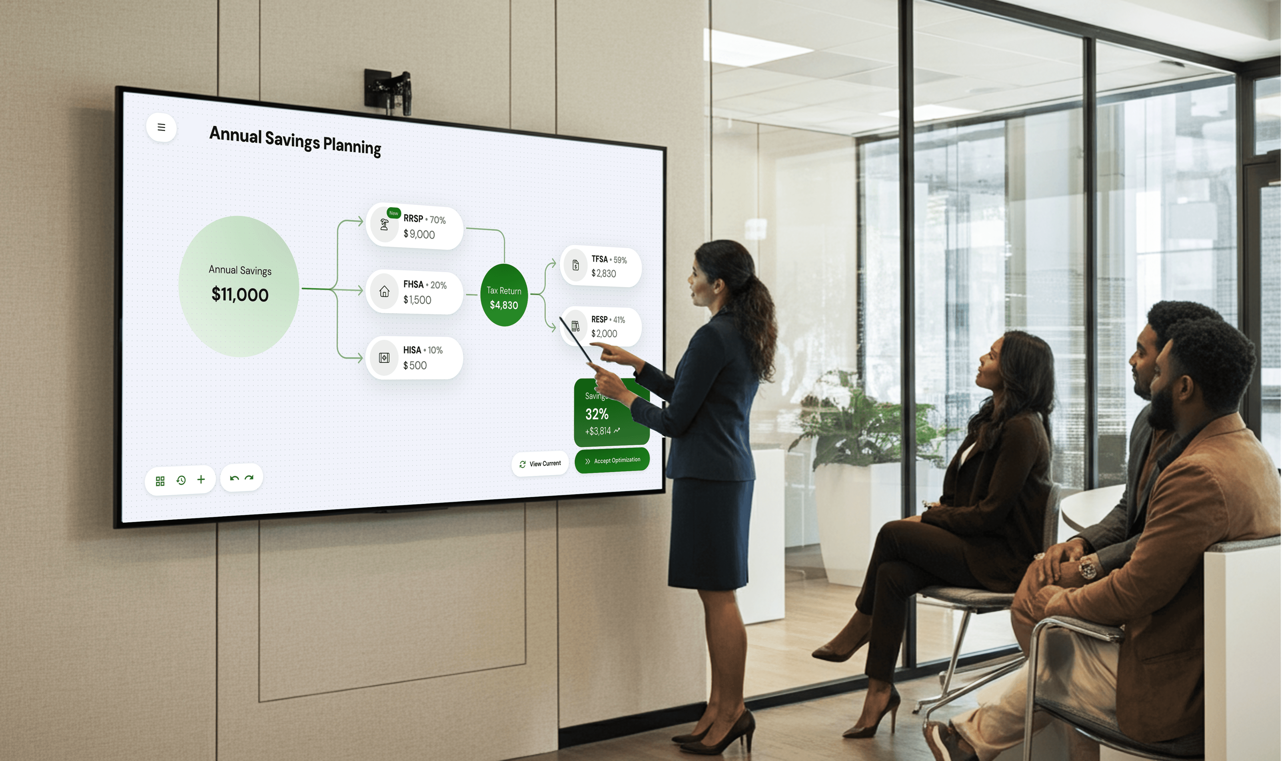
While our pitch centred on a mobile-first experience, I also wanted to acknowledge what traditional banking still does well, in-person experiences. So alongside the mobile vision, I explored how emerging technologies could fundamentally change what an advisor meeting looks and feels like.
From AI that surfaces the right recommendation in real time, to immersive tools that let clients visualize their own financial future in three dimensions.


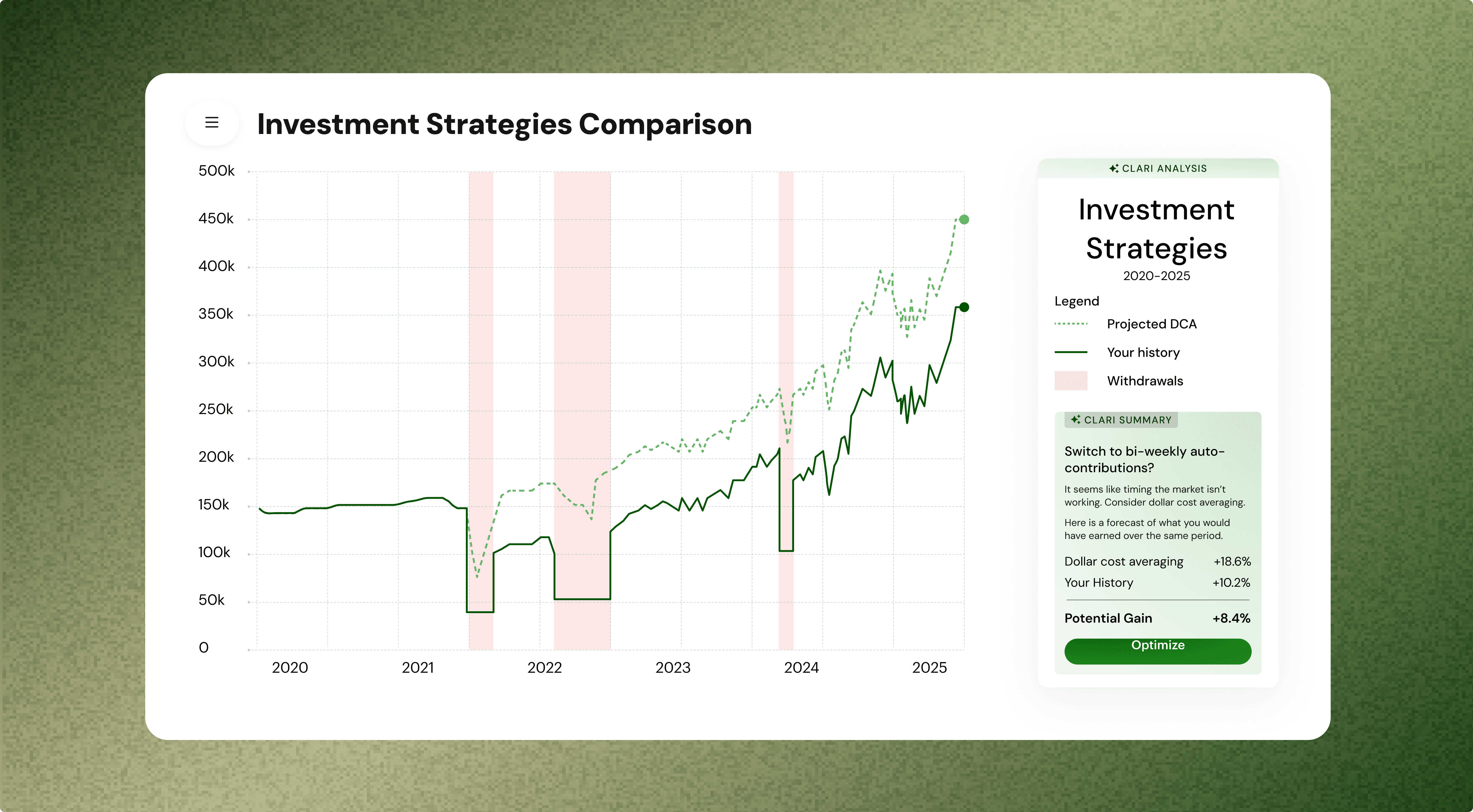
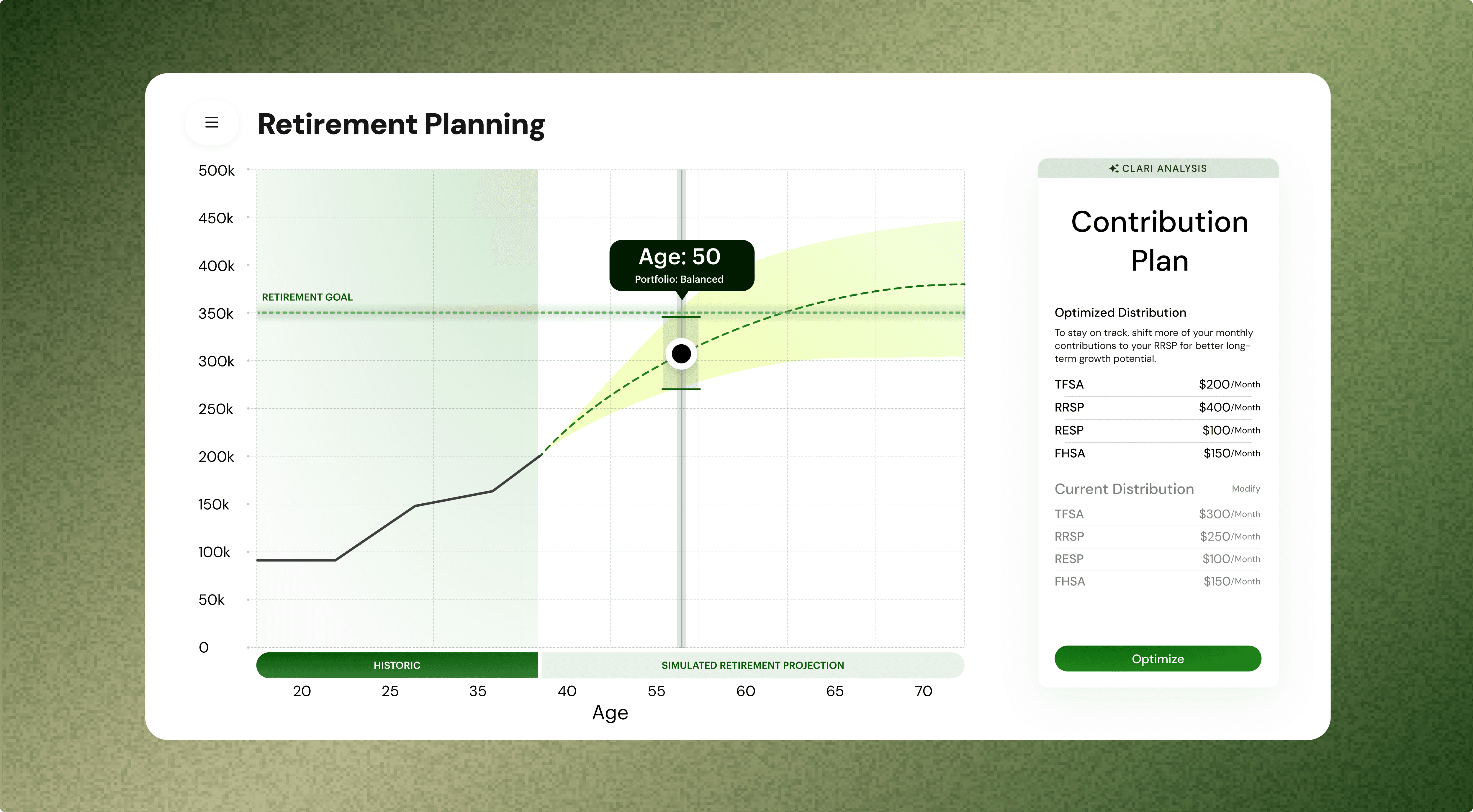
Designing for data that speak for itself
Financial data is only useful if people can actually understand it and designing for a large-format screen meant the visuals had to support interactions whilst communicate complexity instantly to clients.
What did I learn?
Great experiences can come from unexpected places
This project encouraged me to look beyond typical banking patterns. By studying a range of experiences, I learned how to introduce something new without losing the familiarity users expect.
The best concepts survive scrutiny
Some of my favorite ideas didn't make it through reviews so learning to separate personal attachment from product value made me a better designer!